MusicMessage
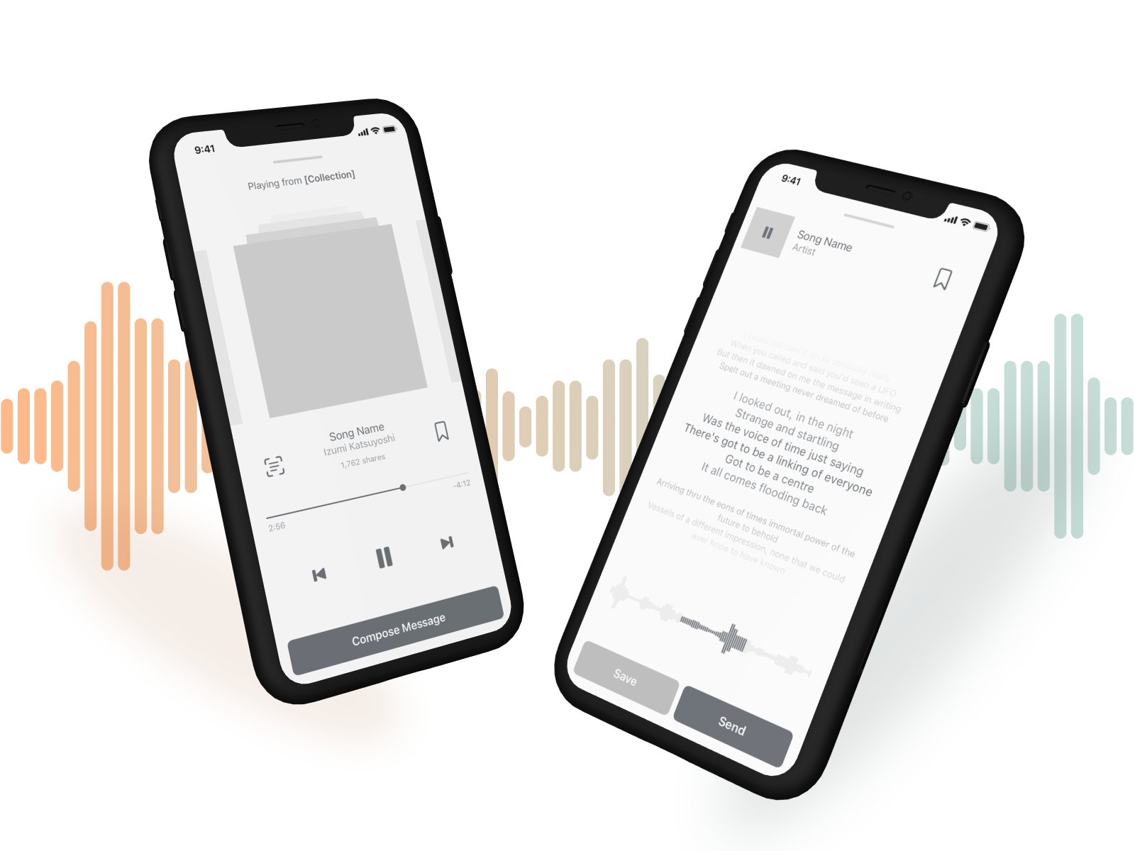
App | UX, UI, BrandingA startup with a vision to share emotions through music. They have a growing library of snippets that capture the essence of songs, and were looking to secure funding with a solid app prototype.
Prototype Link
InVision

Objective
Their goal was to secure funding to develop an iOS and Android app. My role as a UX/UI designer was to design an intuitive interface for a broad demographic, starting with the iOS app.
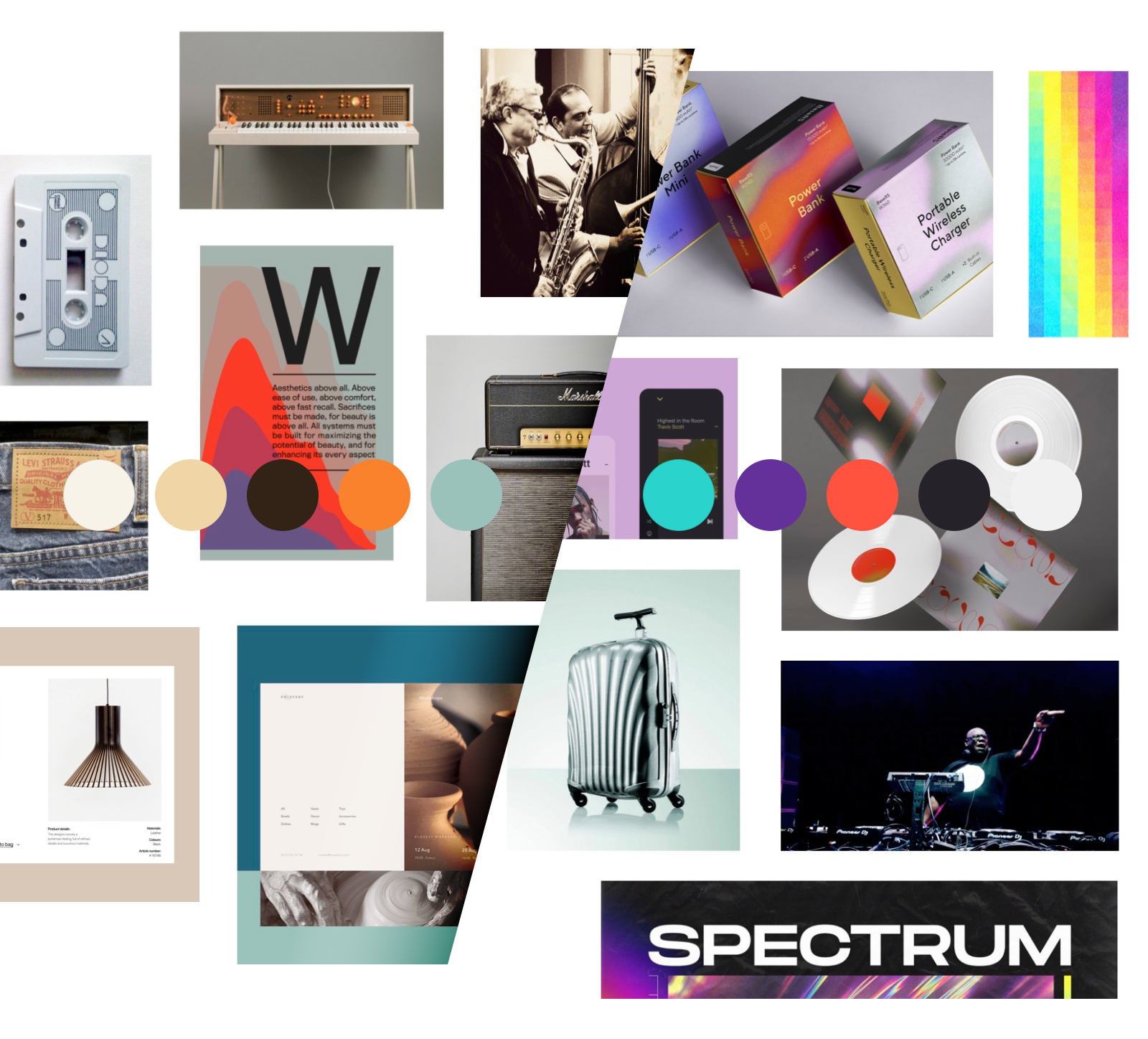
 Two style directions; One inspired by analogue music and the other by digital
Branding Strategy
I first held a design sprint tailored to help them define the characteristics of the brand, and how to position themselves among the competition and their primary target groups.

The Challenge
I set out to simplify the app structure and content with focus on the two primary user scenarios; either they know exactly what song to share, or they know what emotion they want to convey.
Process
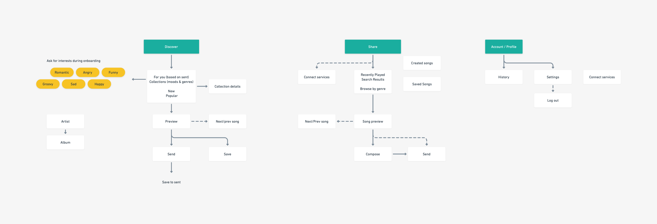
Once the core functionality was defined the prototyping could start. Deciding on an app’s structure is a crucial first step. I started by comparing navigation models to see what best supported the user scenarios.
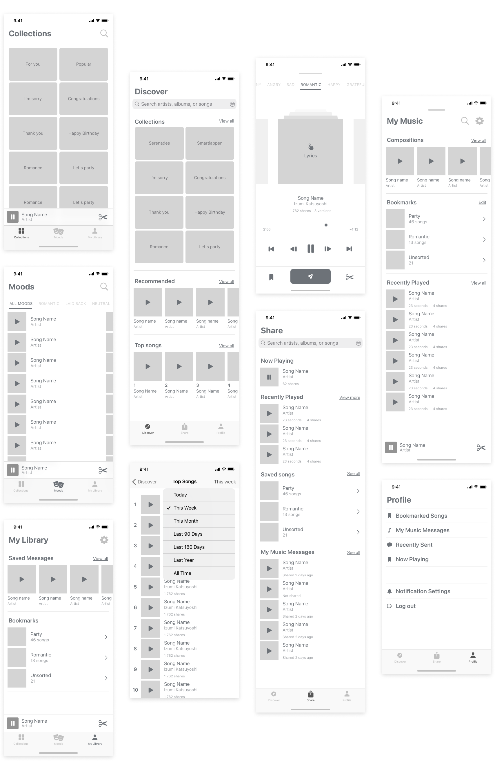
I settled on two prototypes; One with a long, single page, design. And the other using my favorite UI component - the tab bar.
I settled on two prototypes; One with a long, single page, design. And the other using my favorite UI component - the tab bar.

Solution
We settled on a tab bar model for it’s ability to convey both a sense of what the app is about, and what you can do, at a glance.
The default, Discover tab, consists of curated songs sorted into collections. Here you also get personalised recommendations which is a way to promote new artists, and see the most popular songs.
The second, Share tab, is tailored to quickly find the right tune to share at the moment, based on recently played, shared, saved, and created songs.
